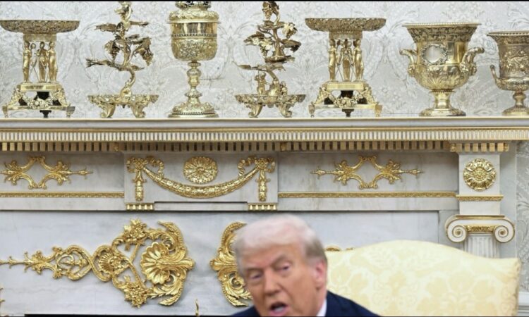
Experts are speaking out about President Donald Trump’s new gold-covered redesign of the Oval Office and other parts of the White House. His changes have grabbed attention everywhere, and many people are upset and confused about the choices he made.
The White House has always been known for its historic and elegant design, but Trump’s updates look nothing like that. From the extremely gold Oval Office, to the flashy new presidential bathroom, to the controversial ballroom he added, everything he touched now looks like it belongs in a casino, a theme park, or even a fancy restaurant anything but the White House. Critics say the new look is loud, overwhelming, and completely ignores the original architecture of the building.
Interior designers and art historians who spoke to HuffPost explained that Trump’s design style says a lot about how he sees power, leadership, and himself.
One interior designer, Sarah Boardman, said her first reaction was shock because the redesign did not respect the White House’s original style. The White House was built with a mix of classical architecture—soft shapes, elegant proportions, and delicate old-style decorations. These details were already beautiful and didn’t need anything extra. Past presidents usually respected that, even when they chose different fabrics or colors.
According to Boardman, Trump went in the opposite direction. The gold decorations he added look like they were bought in bulk and glued randomly on top of everything. She said the style reminds her of the old French palaces from the time of Louis XIV the “let them eat cake” era rather than anything American.
Art historian Robert Wellington, who has studied the style of Versailles and how its influence appears in modern luxury, said Trump clearly loves the Louis XIV look. He explained that Trump’s style mirrors the old European palaces that used gold and luxury to send a message of power.
Later, America’s wealthy families during the Gilded Age copied this same idea to show off their status. Wellington believes Trump is doing the same thing: surrounding himself with gold to create the image of someone powerful and successful.
Another designer, Kelley Wagner, who often critiques Trump’s design on TikTok, also compared the Oval Office to pictures of Vladimir Putin’s extremely luxurious home. She said Trump seems drawn to these palace-style decorations because he believes they make him look strong, wealthy, and in control.
But the problem is that the White House was never built to be a palace. Designers all agree that Trump’s heavy, swirling gold decorations completely clash with the building’s clean, classical style.
The neoclassical design uses straight lines and calm shapes, but Trump’s new additions are full of curls, twists, and bright metallic ornaments. They look like stickers placed on wallpaper, fireplaces, and walls—something professionals say is unusual and unbalanced.
Another expert, Zoe Warren, said Trump’s gold obsession is clearly an attempt to show wealth, drama, and success. Gold has always been linked to power, so using it everywhere makes a strong statement. But in this case, the statement feels more like a performance than leadership.
Boardman said this is what makes the redesign so strange: instead of feeling like a workspace for a president, the Oval Office now looks more like a stage for a TV show.
The ropes, the bright lights, and the decorated background make it feel like a set where someone wants to look powerful, rather than a room where decisions are made for the country.
Wellington added that Trump’s design seems purposely dramatic. It creates the perfect backdrop for televised meetings, photo ops, and displays of authority. It resembles homes or offices where the goal is to impress, not to work.
Designer Isabella Segalovich said the gold is so overwhelming that it chokes the room visually, leaving no space for anything else to stand out. She also noted that Trump seems to enjoy the outrage his design choices create. It fits his public personality of doing things that spark controversy and get attention.
Some designers believe that Trump’s approach is not just about looks but also sends a deeper message. The Oval Office is supposed to represent stability, responsibility, and leadership that serves everyone in the country. Past presidents made changes, but their updates always kept the room calm and welcoming.
Trump’s version, however, feels like it is trying to exclude people. It looks like only certain guests belong there. Boardman said it’s almost as if Trump wanted the West Wing to look like a gold palace meant to celebrate himself rather than a place where public service happens.
Other designers noted that the particular gold Trump used doesn’t even look expensive. Real brass or antique gold has depth and warmth, but the shade covering the Oval Office looks flat and shiny, almost like fake gold. In some photos, the gold even looks slightly green because of the lighting. Standing next to real historic gold-framed portraits, the new decorations look cheap and out of place.
Several experts also said Trump’s new style is the opposite of what is popular in interior design today. Modern design focuses on natural materials, simple textures, soft colors, and calm spaces. People are moving away from flashy, bright gold because it feels artificial.
Today’s trend is “quiet luxury” something elegant but not loud. Trump’s Oval Office, they said, is the exact opposite: it feels extremely “new money,” like someone trying too hard to show off.
The new “Presidential Walk of Fame” and giant decals above portraits stood out as especially strange to designers. They said the oversized decorations look almost cartoonish.
Many experts feel the redesign doesn’t reflect a leader who wants to serve the country but instead reflects Trump’s personal brand a brand that focuses on attention, showiness, and trying to look rich.
Segalovich added that what makes it troubling is not just the design but the message: at a time when many ordinary Americans are struggling financially, the president choosing to pour money into gold decorations feels insensitive. She said the design feels flashy but empty beautiful in Trump’s eyes, maybe, but lacking heart or meaning.
In the end, the experts agreed on one thing: the redesign says more about Trump as a person than about the presidency. It’s not about elegance or history it’s about projecting personal power, even if that means clashing with the soul of the White House itself.


